
UPDATE: Thank you for your feedback so far. Here’s another cover to consider. This is #6:

How’s this? A little classier with an added tagline?
It’s cover choosing time!
Kit Foster of KitFosterDesign.com has created the cover for Season 3 of This Plague of Days and it is wonderful. I have no doubt you’ll be impressed. I’ll leave that awesome reveal for later. It’s different from the other covers, but, given where Season 3 takes us, that’s appropriate. It gets weird. I’m aiming for Strangest Zombie Apocalypse Series Ever Award. It’s given out by the Nobel committee each year, but the competition is stiff and those nerdy Nobel chemists grab all the glory.
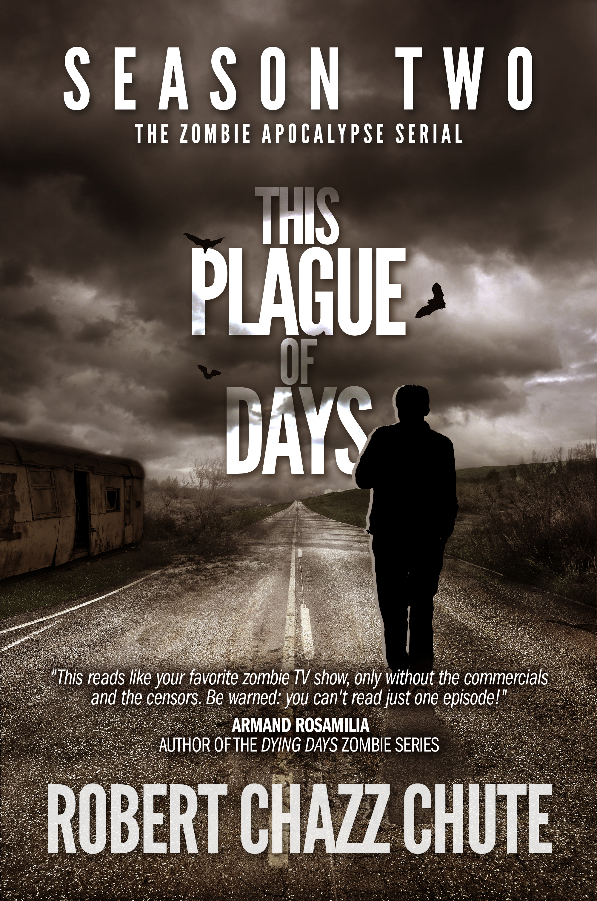
Season 3 is due out on Father’s Day.
You can pick up Seasons One and Two through the affiliate link at AllThatChazz.com if you’re so inclined (and if you like autistic heroes trying to save the world from several kinds of monsters, including humans.) There are a couple of sneak peeks below this post, too, if you’re looking for more of a taste.
About that prize for a random assist: the compendium of Seasons 1, 2 and the finale in 3 will launch on Father’s Day, too.
In addition, I’m taking care of the cover for the Plague of Days compendium myself. About that, I have many doubts. Which cover do you prefer?
Please let me know which one you like best in the comments, 1, 2, 3, 4 or 5? A combination of several elements? None?
Thanks for helping me out with these heavy decisions as the big day approaches! And by “big day” I’m referring, of course, to the release of the pandemic flu virus that will kill most of us, turn a bunch more into zombies and…well…it gets worse as the virus mutates. Have a great day!
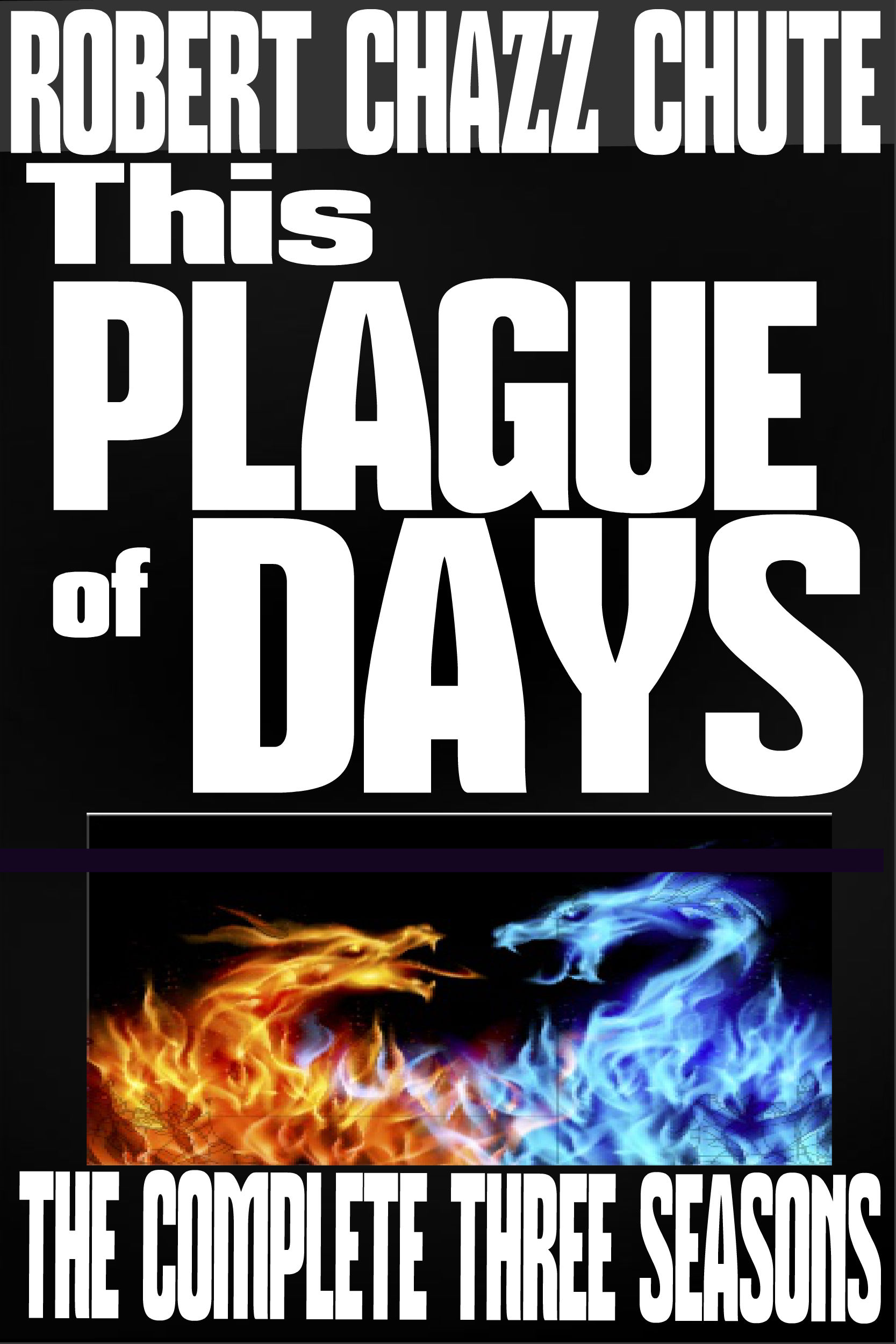
1.
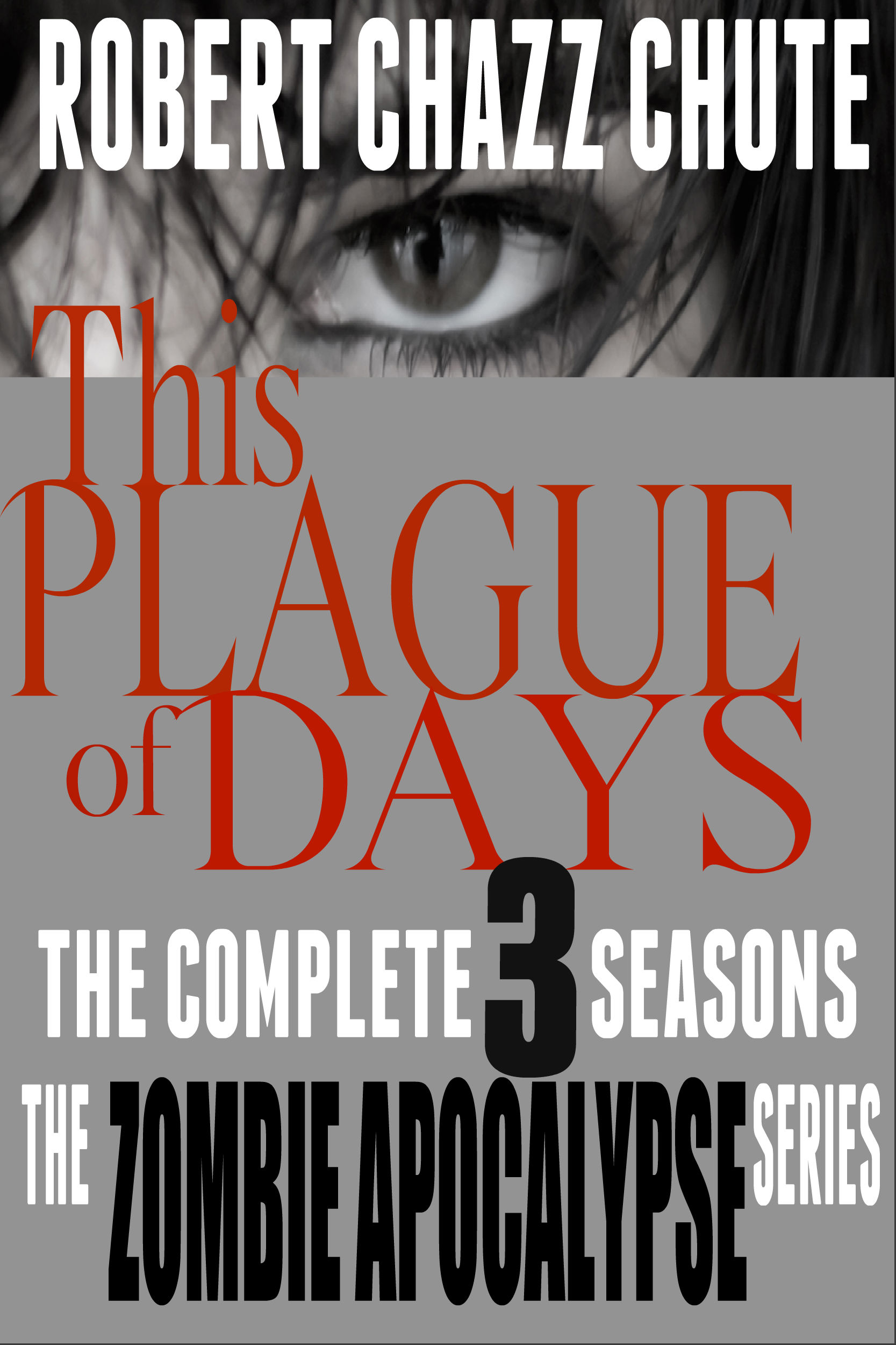
2.

3.
4.

5.


June 11th, 2014 at 8:01 am
No wonder you are having such a tough choice! All fabulous! After much staring and scrolling, I’ve come down to #4 and #5. Love the font of 4, but having seen the eye element of #5 (love it!!), I’d hate to see it not be used. So the logical extension for me would to see how a combination of 4 and 5 would work (eye element on top, but instead of the grey, somehow use the fantastic element from #4).
If I REALLY HAD to choose between the two, I would tend towards #4.
June 11th, 2014 at 11:25 am
All the covers are great, but I liked 1 and 2 the best
June 11th, 2014 at 12:56 pm
I like three best, four next
June 11th, 2014 at 3:15 pm
I liked #2 the best, but all of them have something going for them. Nice work.
June 11th, 2014 at 4:01 pm
[…] I’m giving away an ebook of the Plague of Days compendium to one random commenter on the Plagu… […]
June 11th, 2014 at 9:05 pm
Definitely #4. It reaches out from the screen and captures my attention best. I can envision it on a shelf highlighted amongst the others around it. #5 was my second choice, but it doesn’t “pop” as much visually.
June 11th, 2014 at 9:38 pm
OK I’m gonna be honest. I don’t really like any of them. I am sure a lot of thought went into the covers above but for me they feel underwhelming and cheap looking at least in comparison to the individual episode covers. I do like the font of cover 5 if that helps at all.
June 11th, 2014 at 10:25 pm
I love #2 because of the book on the bottom- it gives some insight on how the latin books tie into the autistic boys life:)
June 12th, 2014 at 2:14 am
I prefer the last one. Although I would rather see one that goes with the other covers in the series.
June 12th, 2014 at 2:39 am
Thanks, Stacy. The Season 3 cover has somewhat of a touch of the first two Season covers. However, the story goes in a surprising direction as the big secrets are revealed so it reflects that, too. It’s a tough balance. At first I wanted to keep them more similar, too. However, I suspect the coming change up will give all the books a boost.
Also, the compendium cover chosen here will be temporary until my regular designer does it, thank Thor.
June 12th, 2014 at 4:57 am
I like #6 too… Your name and the title really “pop.”
June 12th, 2014 at 2:10 pm
My choice is cover number four. The fiery dragons remind me of The Game of Thrones for some reason, so that I’m not exceptionally keen on. I don’t prefer the covers with the eyes on them either. It reminds me of various detective novels I’ve come across. As with many others I’ve become partial to the covers on Seasons One and Two. So yes, my choice is cover number four.
June 12th, 2014 at 5:23 pm
I feel like it might be too late for me to reply, but I liked the one with the eye, #5. I also hoped they would be closer to the previous covers, but having not read the aforementioned surprising directions and turn of events, I guess I have to trust your judgment on the other selections. 🙂
June 12th, 2014 at 6:45 pm
That’s a tough choice. My personal favorite number 6 though. I think if the eye picture was faded off in the background it would be complete. And slightly smaller font maybe. 🙂
June 12th, 2014 at 10:50 pm
I choose #1. I would have preferred #5 but the large amount of gray background is too flat and bland.
June 13th, 2014 at 1:05 am
No design skills. Just a person who loves books. #4.